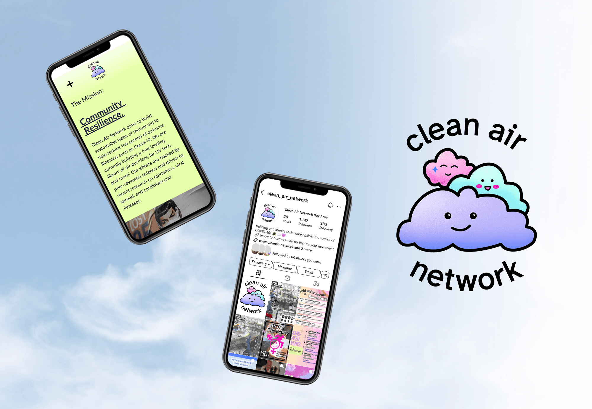
Clean Air Network needed an identity that felt welcoming, trustworthy, and easy to navigate for a broad community of participants, including disabled and immunocompromised people seeking access to clean air resources. I developed an accessibility-first visual identity centered on clarity, readability, and inclusion. The system uses the Atkinson Hyperlegible typeface to improve legibility for low-vision users, paired with a high-contrast color palette and simple visual hierarchy to support clear communication across digital and print materials. The cloud-inspired logo reflects the organization's focus on collective care and mutual aid, while the broader identity system was designed to reduce barriers to participation and help community members quickly understand available resources and services. This project reinforced my belief that accessibility is not an add-on to design — it is a fundamental part of creating experiences that help people feel informed, welcomed, and supported.
Client:
Clean Air Network
My Role:
Designer
Year:
2024
Service Provided:
Accessibility, Brand Systems, Community Engagement


